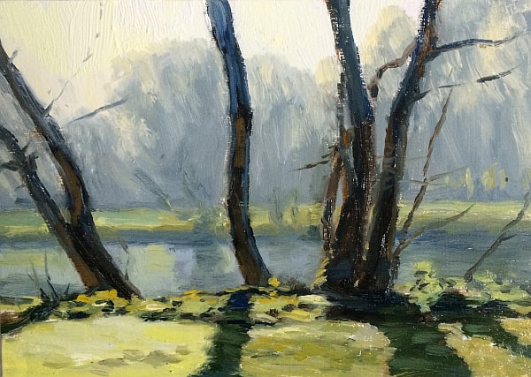
 Oil painting on panel 5x7" I wanted to make the most of the last day of sunny weather by getting outdoors, and I'm glad I did as the light by the river was incredible. Signs of spring such as catkins on the trees are transforming the view. The last time I painted here it was frosty - this morning there was a lot of dew which gave a similar effect. I’m not sure if it’s the increasing strength of the sunlight, or that I’m beginning to see a little differently with practice, but there seems to be a lot more blue in the shadows at the moment. It’s most noticeable when looking back at the scene after looking away for a little while. After half a second looking at the view the colours appear much greyer as my eyes adjust. But it seems to me that getting some of this initial impression of colour into the painting is important in establishing the light effect. I think I could have pushed the chroma of the blue in the distance up a little higher than I did to enhance this. It’s something I’ll play around with in future.
0 Comments
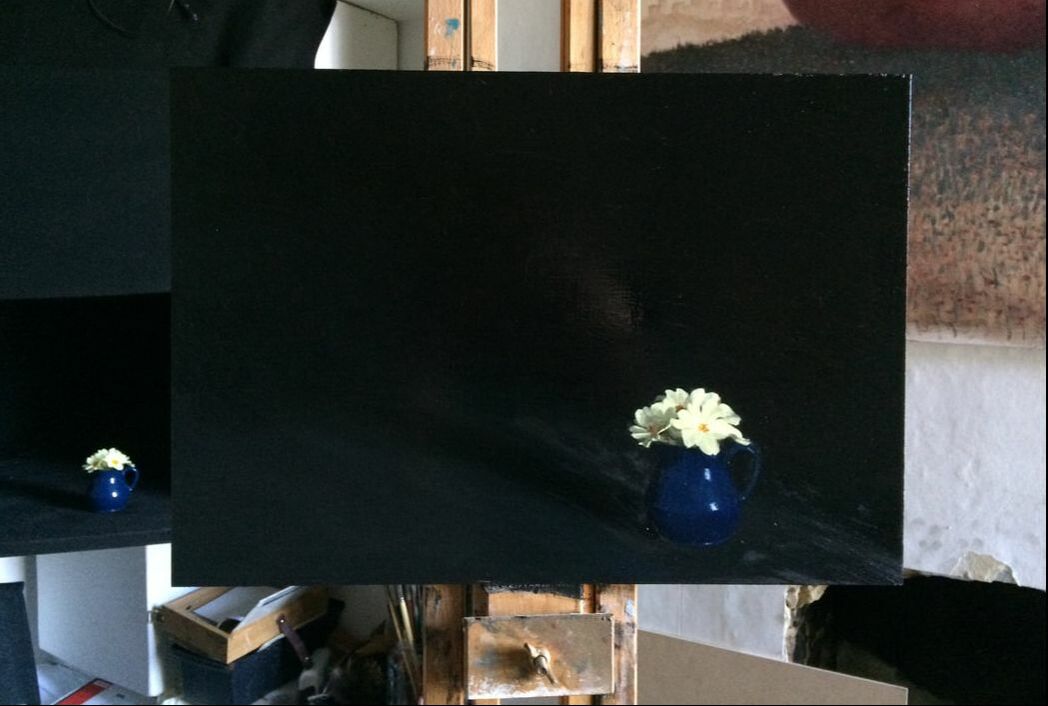 Oil painting on panel 16x11" Here’s what I’ve been working on for the last couple of mornings. Its on a much larger panel than I usually use (16x11”) and its a bit experimental- placing the brightly lit primroses really close to the edge of the panel with the rest of the panel filled with the darkness behind. I wanted to see how far I could push the primroses to the edge of the composition and still get the picture to work. The photo has lost some of the detail in the darks and lights, but in the painting it seems that the diagonal line of the cast shadow balances the primroses. I think the effect is quite dramatic, highlighting both the fragility of the flowers and the brightness of their petals in the light. I’m going to try out some more flowers on larger panels like this.
I managed to make four paintings over the half term holidays - I had to stay up late to do them, and because my kids happened to be not sleeping too well I found I just couldn't keep going for the whole week! Also I didn't get time to update my blog, just facebook and instagram. 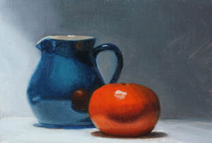 6x4" oil painting on panel 'Blue Jug with Clementine' (available from Newbloodart) I'm still trying out the possibilities that I can create with my shadow box. I like the incredible amount of shine this set up created, and the diagonal shadow in the background. It was good to work with a light coloured background for a change after all the dark paintings I've been working on. 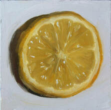 3x3" oil painting on primed card 'Lemon Slice' available from Etsy 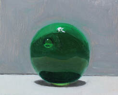 4x3" oil painting on primed card 'Green Marble' (available from Etsy) 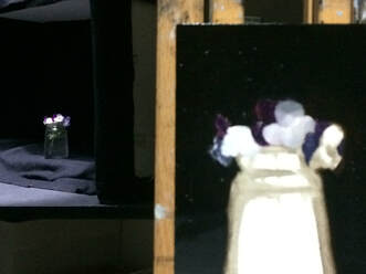 Above is the set up for my final painting of the week. There is something very theatrical about the overhead lighting in my shadow box, combined with the black fabric. The jar of heartsease reminds me of a dancer waiting in the wings. The intensity of the light really makes the petals glow, and I like the way it picks out the leaves within the jar. 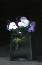 6x4" oil on panel 'Heartsease'
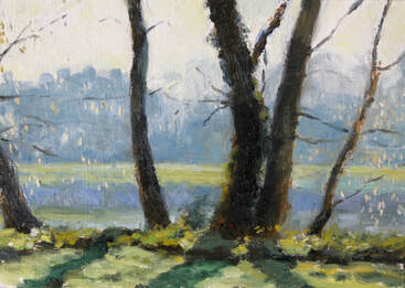
 Oil painting on panel 5x7" Another bright frosty morning had me setting up my easel by the banks of the river Thames again. This group of trees is becoming a recurring motif in my paintings. You can find it in Orleans Gardens, looking over towards the Ham side of the river.
There was a lot of haze in the air which really increased the atmospheric perspective. Its only a couple of weeks since the last frosty painting but the light seems very different already as the sun is now higher and the light stronger. Maybe because of the smaller panel size, I didn't feel in such a rush this morning. I remembered to step back and consider the overall effect a lot more. I've been thinking about how to create colour harmony and researching this in Edgar Payne's book, Composition of Outdoor painting. I used a lot of blue and yellow today, it seems to tie the piece together quite well. 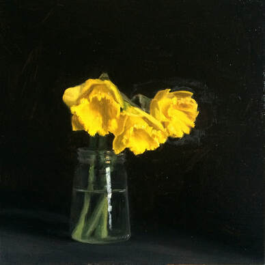 Oil painting on panel 8x8" It was tricky to rearrange the daffodils exactly as they were the day before, I resorted to wiring one of the stems with a pipe cleaner from my daughter’s craft box (must get some florist’s wire).
Although I’m painting flowers, I have to stop myself from getting into too much botanical detail because it’s my visual impression that I’m trying to record. I have to remind myself to get back from the painting, to not try to make the painting look like daffodils but just to judge shapes and values and try to get everything in the right place. I’m always asking myself how much I really need to say about each section, and what degree of resolution am I aiming for? I paint first with filbert hog bristle brushes, I also use a few size 4 kolinsky sables for details or layering up strokes. I often go back over with the hog bristles at the end - simplifying the values as much as I can, eliminating detail from both the lights and shadows. 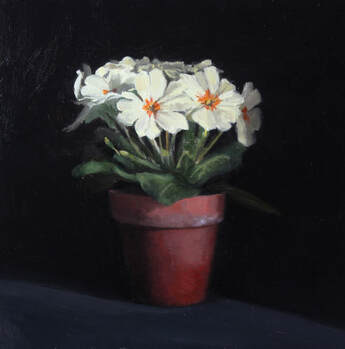
Oil painting on panel 8x8"
One of the positives to come out of my daily painting practice has been trying out new subjects. I've really got into painting flowers, and have decided to make a series of flower paintings. I think most of these are going to take me two sessions rather than one (remember I only have a couple of hours per day to create my daily painting - not a whole day) so while I'm doing these I will be posting every other day.
I'll still do other smaller daily paintings on the days I'm not working on this series. These primroses were really hard to paint! The petals are almost flat and as a result had the very subtlest changes in value across them. The folds in the petals were quite crisp and deep, hard to suggest without overdoing and creating very hard edges. I think I spent a large amount of time making adjustments to those creases and getting very frustrated with the results. Its one of those paintings I like better now I can't see it compared to the subject! It seems to work ok as a painting but really I didn't feel that I'd done the primroses justice at all at the time. I've included some process shots below. I started with the pot and foliage but could equally have started with the flowers, in fact I think that would probably have made more sense as the flowers are likely to change much more. I'm starting with the flowers in my latest painting of some daffodils and will do a blog post about it tomorrow. I hope the process photos are interesting, and maybe even useful if you are learning to paint. If you have any questions, please leave a comment, I'd be glad to help. Oil painting on primed card 6x4” The shiny red skin of this apple makes it an irresistible subject to paint - however high chroma objects like this are quite difficult to render. It’s impossible to match the chroma in the lighter values, so I add in a little cadmium yellow medium which takes the hue around towards orange but keeps the chroma quite high. The values in the mid tones and lights are pretty compressed as well. I’d love to hear from other artists how they get around the high value, high chroma problem in their paintings. 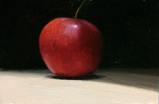  Oil painting on panel 6x3" I haven't managed any painting for nearly a week now. Both my children were ill with the flu so I couldn't find any time at all. Felt pretty rusty this evening trying to get back into it! Here's a little drawing I did of my daughters while they were sleeping on the sofa. 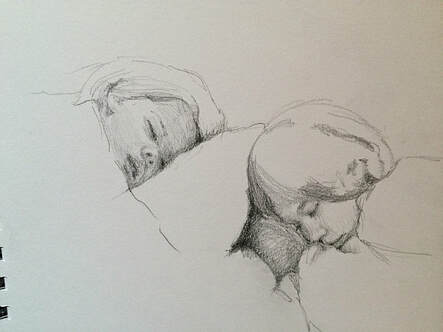 I hope to get back to normal with a painting every day from now on. 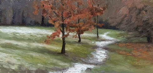 Oil painting on mdf panel 9x4" At last I got to paint some snow! There was hardly any snow left on the riverbank so I carried on to Marble hill park, Twickenham, where there was a light dusting of (rapidly melting) snow. I found this little snowy track leading into the trees. I was surprised to see dry leaves still attached to the saplings, which along with the green grass and violet grey in the distant trees created a colour triad. The scene reminded me of Isaac Levitan's paintings. 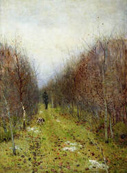 Isaac Levitan, Autumn Landscape 1880 (photo from Wikipedia) About 30 minutes into the painting it started sleeting lightly. To protect the painting I tilted the easel forward a bit, and lowered the lid of my pochade box (which I was using as a palette) . 30 minutes after that the sleet really set in - I had painted the whole panel loosely so I packed up to finish at home. This is how the painting looked at that stage (the white patch at the top is where the clip was holding the panel to the easel) 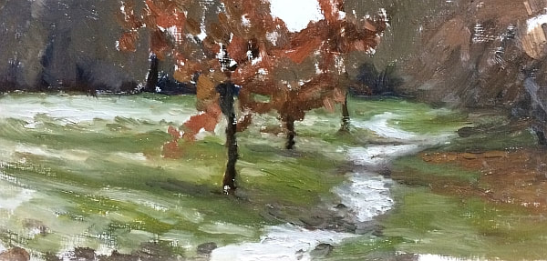 Back in the warm with a cup of tea it was a matter of trying to get the shapes and values right from memory. I was aiming to improve the composition and the accuracy of the drawing using what I know of perspective. I think accurate drawing is so important in this type of painting - it’s key to getting the sense of being really there -feeling present in the landscape. If the drawing is off it is a big distraction to me. I think the drawing is ok in this painting, but being cold and in a hurry I didn't exactly do my best. I noticed that the three foreground trees were very evenly spaced which is problematic, so I moved the furthest of the trees slightly to the right.
I hope I've managed to capture something of the mood anyway, which is the most important thing for me. And also kept the brushstrokes loose and interesting when seen close up. |
About meI am a realist painter, working in oils, painting landscape and still life. Archives
April 2021
Categories
All
|
 RSS Feed